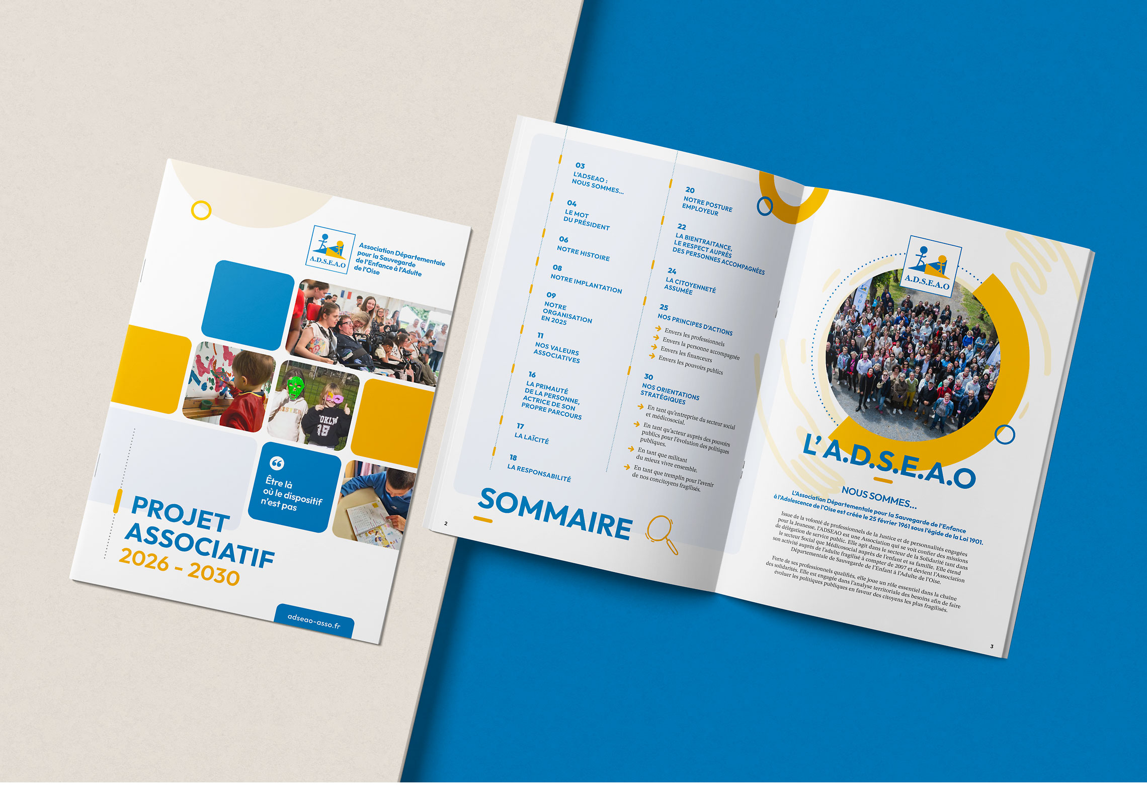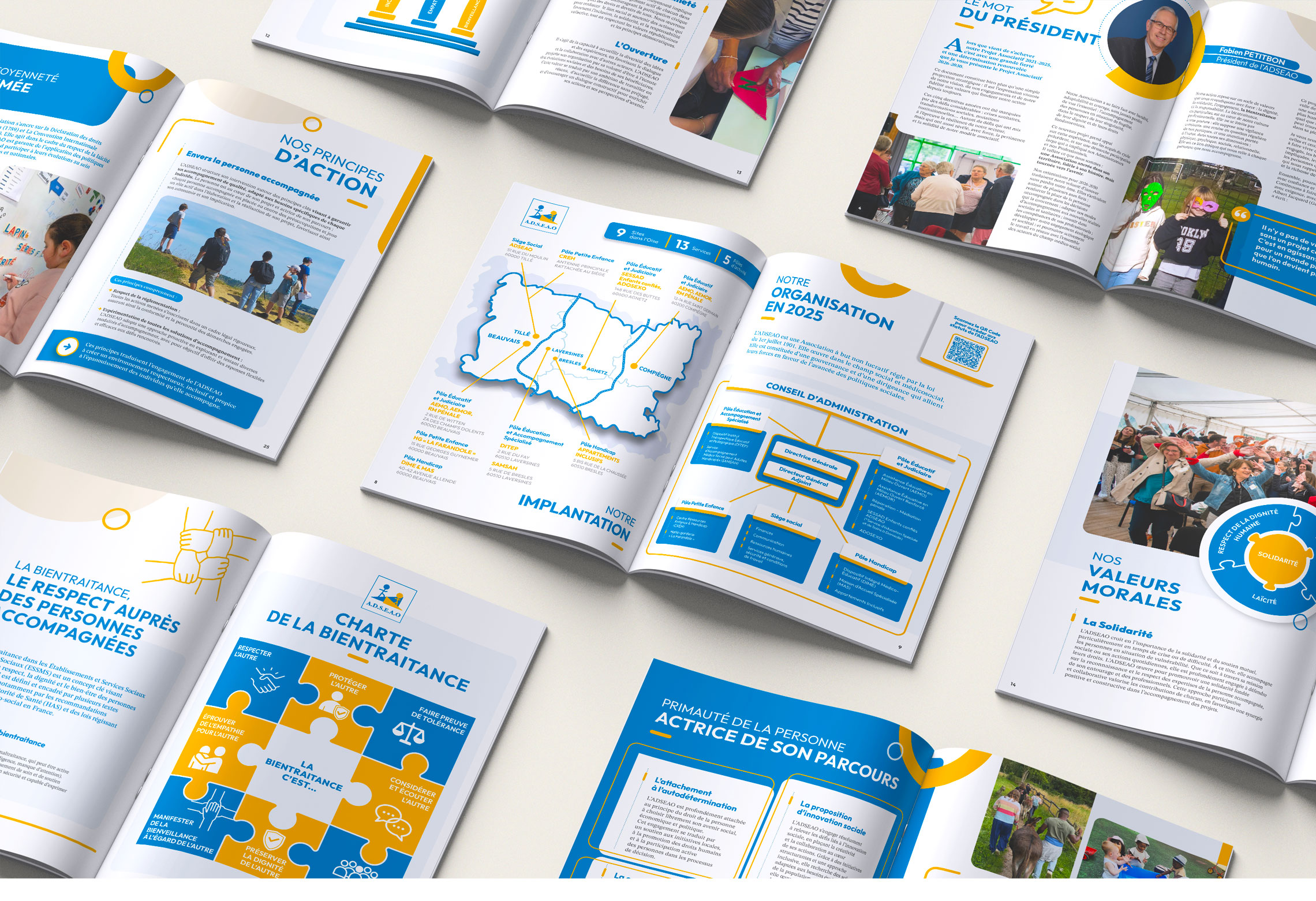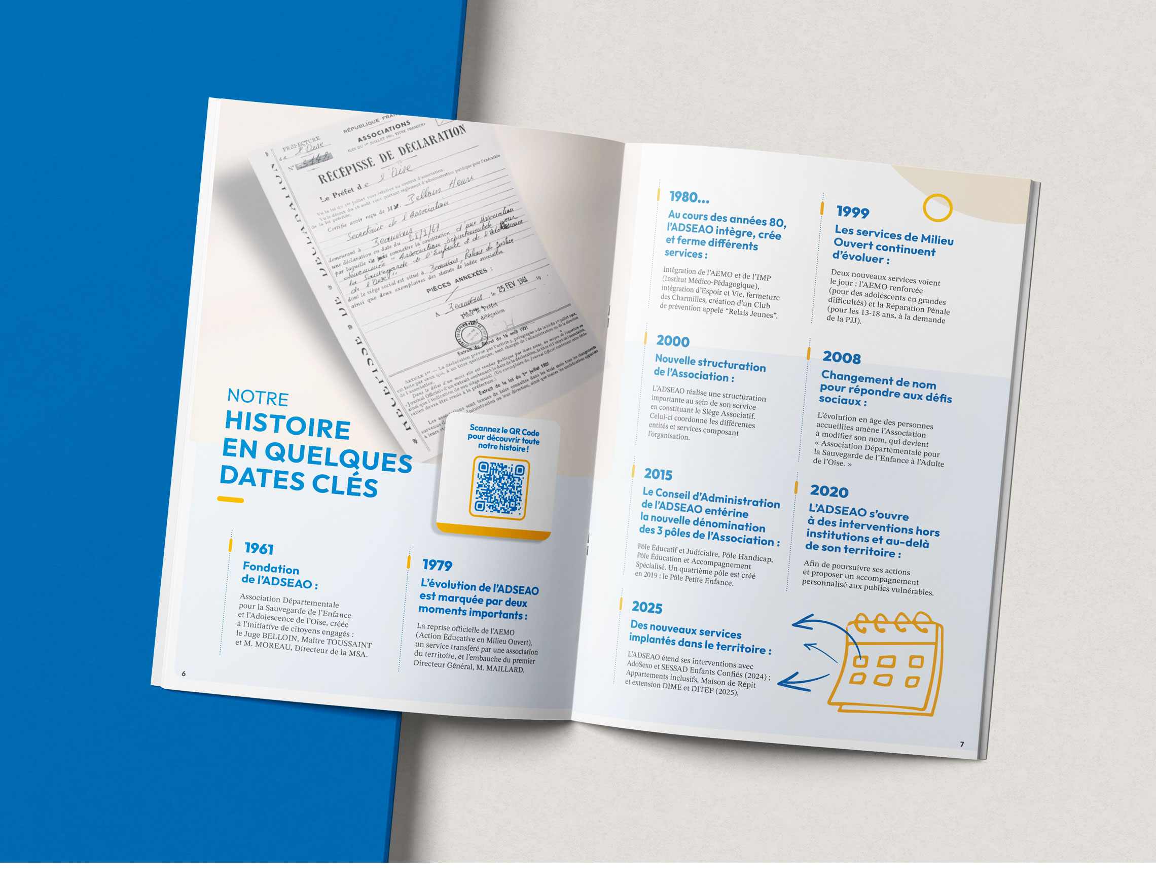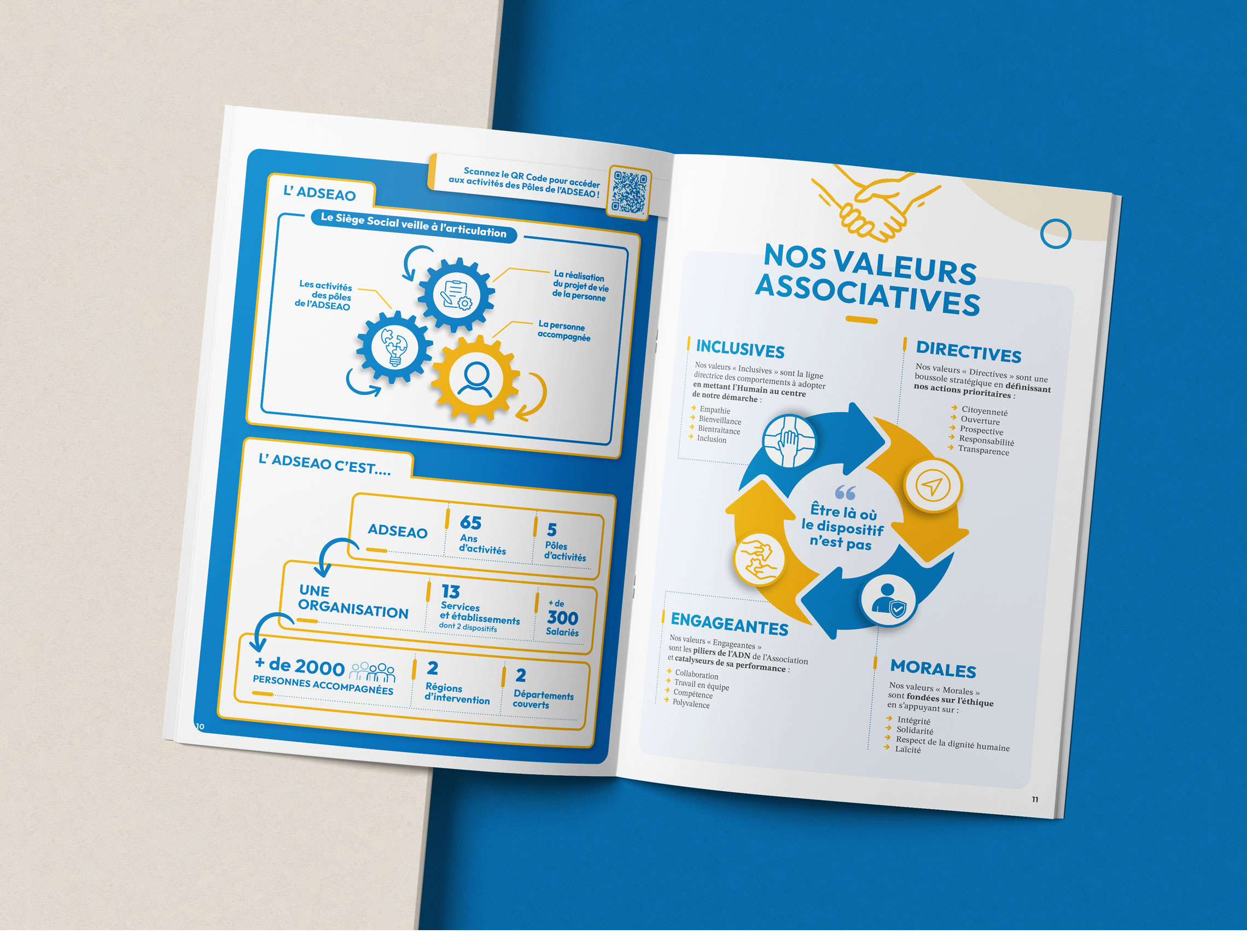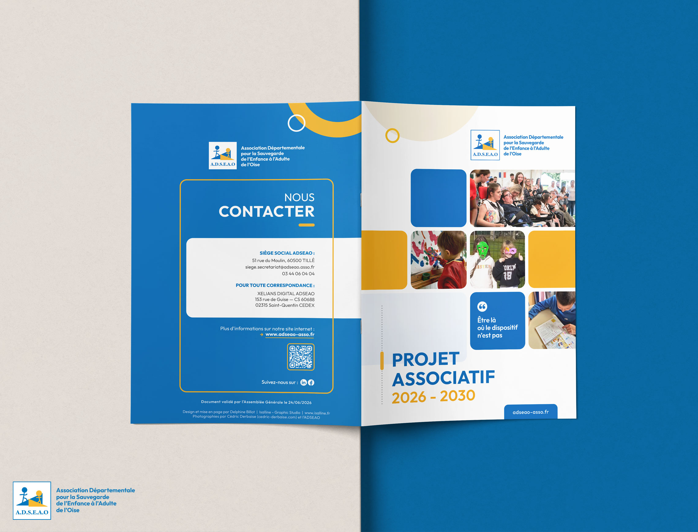
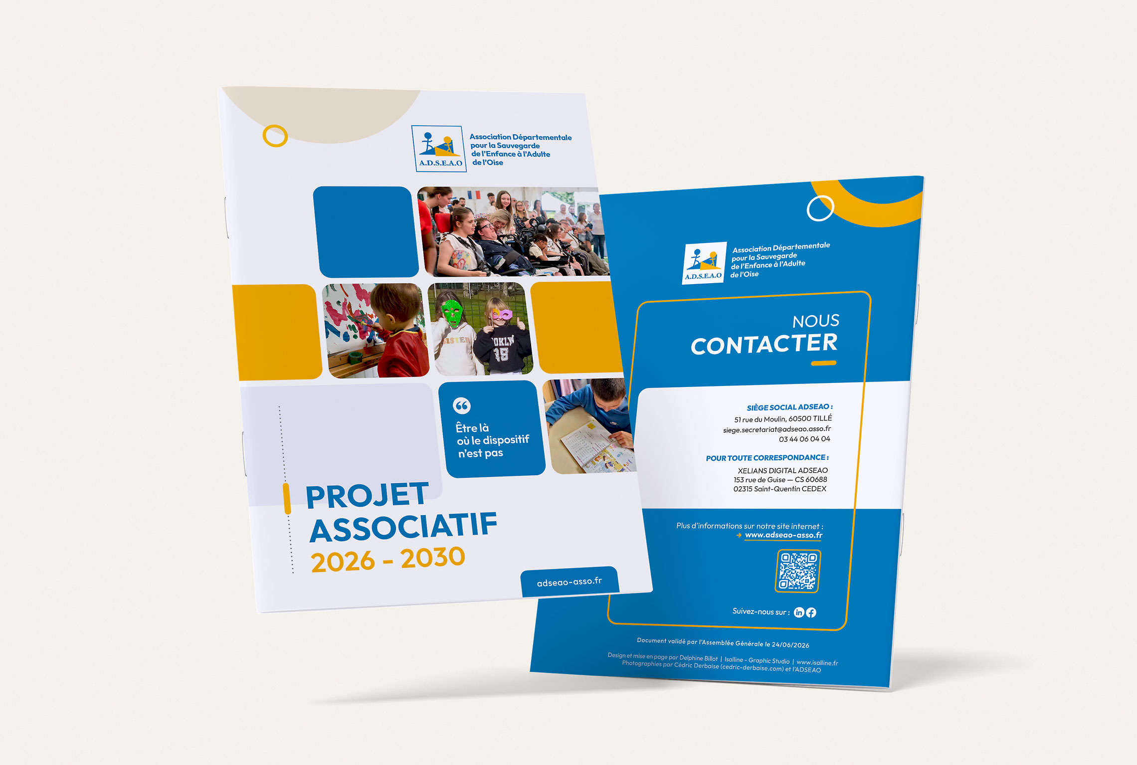
To support the launch of its 2026–2030 Strategic Plan, the nonprofit organization ADSEAO (Departmental Association for the Protection of Children and Adults in the Oise region, France) entrusted me with the complete art direction and design of its 32-page institutional publication.
The main challenge of this project was the absence of a genuine visual identity. Apart from the association's historical logo—which had to be retained—and its two institutional colours, no brand guidelines or visual framework had been established. My role was therefore to create a complete graphic universe capable of modernising the association's image while remaining faithful to its existing identity.
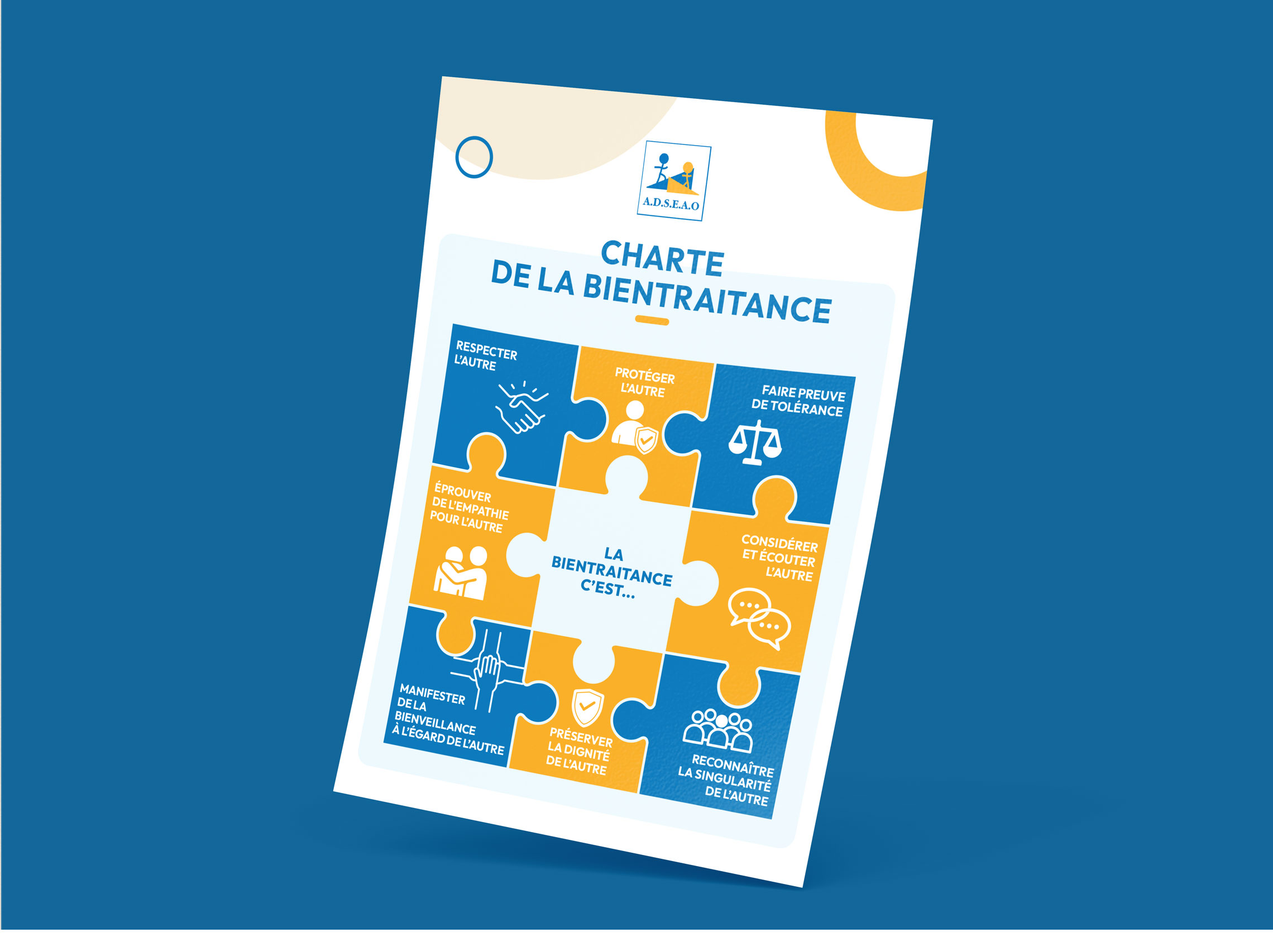
I was responsible for the project's overall art direction, including the development of the graphic identity, layout, information hierarchy, diagrams, infographics and custom illustrations, as well as photo retouching and the preparation of print-ready and web-ready files.
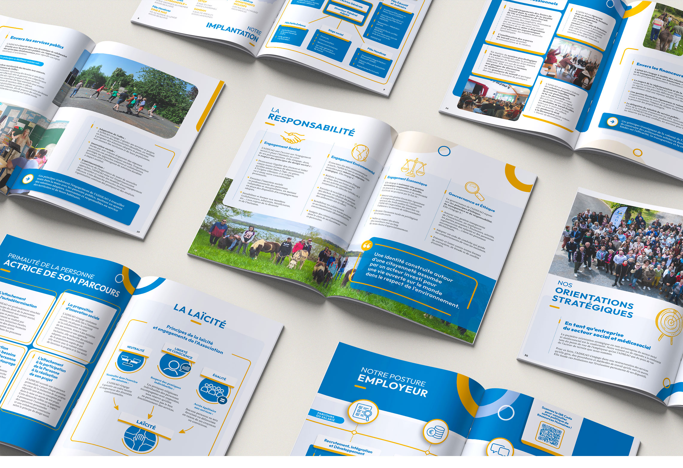
The objective was to transform a particularly content-rich institutional document into a publication that is engaging, contemporary, educational and easy to navigate. Every spread was carefully designed as a communication tool in its own right, combining editorial content, photography and graphic elements to create a clear visual rhythm and improve the readability of the association's strategic information.
Beyond the creative challenge itself, some projects remind us that graphic design is ultimately about giving meaning to messages, making complex ideas accessible and highlighting the commitment of organisations working every day to support others. This collaboration with ADSEAO was one of those rare and meaningful projects. I would like to sincerely thank the entire ADSEAO team for their trust throughout this collaboration.